Meracikopi
Meracikopi
Meracikopi
An updated landing page for a local coffee shop in Balikpapan, Indonesia
An updated landing page for a local coffee shop in Balikpapan, Indonesia
An updated landing page for a local coffee shop in Balikpapan, Indonesia
Role:
Role:
Role:
UI/UX Designer
UI/UX Designer
UI/UX Designer
Project:
Project:
Project:
Meracikopi
Meracikopi
Meracikopi
Year:
Year:
Year:
2019
2019
2019
Project Overview
Project Overview
Project Overview
To kickstart this project, first I had a discussion with the business owner and several of their customers, and I got some valuable information which are:
To kickstart this project, first I had a discussion with the business owner and several of their customers, and I got some valuable information which are:
To kickstart this project, first I had a discussion with the business owner and several of their customers, and I got some valuable information which are:
Problems
Problems
Problems
The old website was their first website when they were founded in 2017, so they didn’t prepare the content and the design that well.
The old website was their first website when they were founded in 2017, so they didn’t prepare the content and the design that well.
The old website was their first website when they were founded in 2017, so they didn’t prepare the content and the design that well.
Now as they grow bigger, they need a better content structure and of course better and fresher design to represent their brand.
Now as they grow bigger, they need a better content structure and of course better and fresher design to represent their brand.
Now as they grow bigger, they need a better content structure and of course better and fresher design to represent their brand.
Goals
Goals
Goals
Brand awareness. Showing that Meracikopi is a premium brand, convinces people that their products are tasty yet maintain high quality. So people don’t see Meracikopi as just “another coffee shop” among hundreds of coffee shops in Balikpapan
Brand awareness. Showing that Meracikopi is a premium brand, convinces people that their products are tasty yet maintain high quality. So people don’t see Meracikopi as just “another coffee shop” among hundreds of coffee shops in Balikpapan
Brand awareness. Showing that Meracikopi is a premium brand, convinces people that their products are tasty yet maintain high quality. So people don’t see Meracikopi as just “another coffee shop” among hundreds of coffee shops in Balikpapan
People don’t see Meracikopi as just “another coffee shop” among hundreds of coffee shops in Balikpapan. Having a website showing that Meracikopi is serious and professional. Showing the vibe and feel of 1 of their beautiful outlet located in Indrakila, Balikpapan.
People don’t see Meracikopi as just “another coffee shop” among hundreds of coffee shops in Balikpapan. Having a website showing that Meracikopi is serious and professional. Showing the vibe and feel of 1 of their beautiful outlet located in Indrakila, Balikpapan.
People don’t see Meracikopi as just “another coffee shop” among hundreds of coffee shops in Balikpapan. Having a website showing that Meracikopi is serious and professional. Showing the vibe and feel of 1 of their beautiful outlet located in Indrakila, Balikpapan.
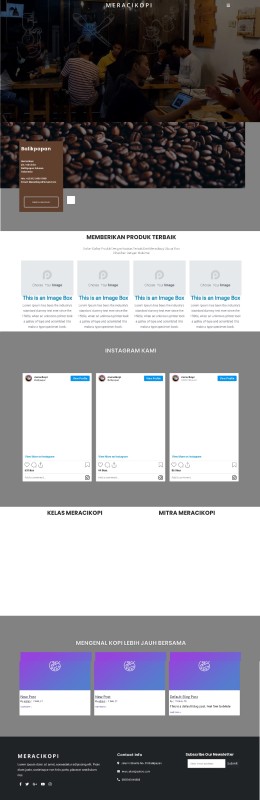
Meracikopi’s old website
Meracikopi’s old website
Solution & Process
Solution & Process
Solution & Process
Gathering Requirements
Gathering Requirements
Gathering Requirements
I ask the owner some questions like the goals of the site, what they want to achieve, the look and feel that they’re looking for, and also some website inspiration. So they want simple pages, minimalist, and not using many colors, only colors that represent their brand guideline. An important note is, that they want the site to represent the vibe of their outlet in Indrakila, Balikpapan.
I ask the owner some questions like the goals of the site, what they want to achieve, the look and feel that they’re looking for, and also some website inspiration. So they want simple pages, minimalist, and not using many colors, only colors that represent their brand guideline. An important note is, that they want the site to represent the vibe of their outlet in Indrakila, Balikpapan.
I ask the owner some questions like the goals of the site, what they want to achieve, the look and feel that they’re looking for, and also some website inspiration. So they want simple pages, minimalist, and not using many colors, only colors that represent their brand guideline. An important note is, that they want the site to represent the vibe of their outlet in Indrakila, Balikpapan.
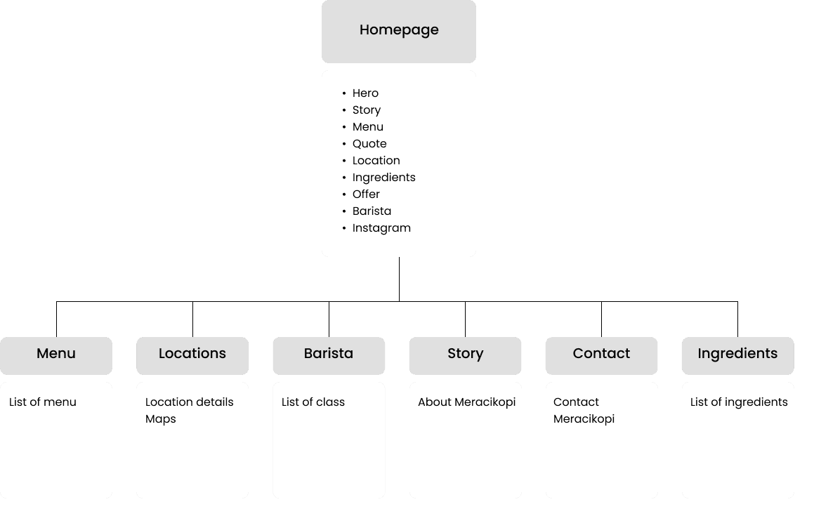
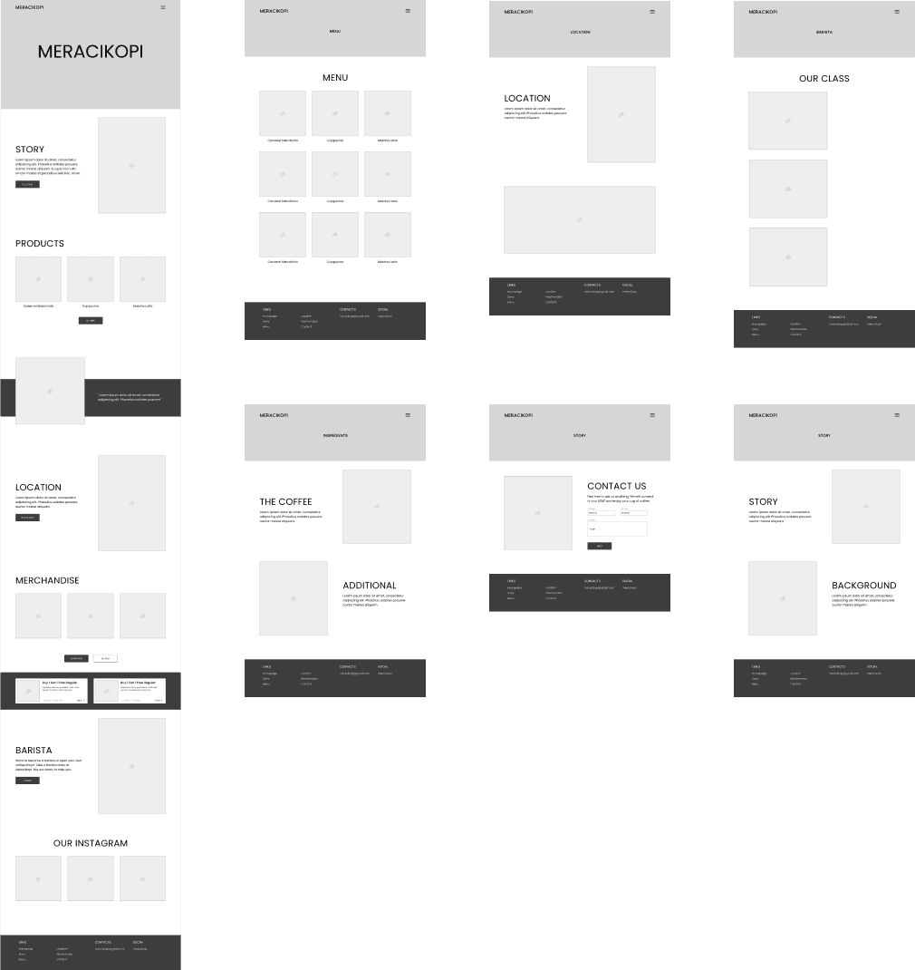
Sitemap
Sitemap
Sitemap
Since they already have the content structure, the first step that I took when we had a deal was creating a sitemap so everyone could see the whole structure of the website. This sitemap is very useful to see how big the scope is and also as my guide when designing the pages. When the sitemap is done, I send it to them for approval before continuing to the next step, the wireframe.
Since they already have the content structure, the first step that I took when we had a deal was creating a sitemap so everyone could see the whole structure of the website. This sitemap is very useful to see how big the scope is and also as my guide when designing the pages. When the sitemap is done, I send it to them for approval before continuing to the next step, the wireframe.
Since they already have the content structure, the first step that I took when we had a deal was creating a sitemap so everyone could see the whole structure of the website. This sitemap is very useful to see how big the scope is and also as my guide when designing the pages. When the sitemap is done, I send it to them for approval before continuing to the next step, the wireframe.
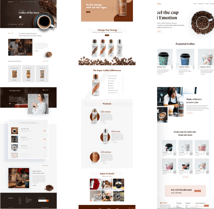
Looking for Inspiration
Looking for Inspiration
Looking for Inspiration
To better understand how the client wants the website to look, I looked at several website design references with a minimalist, clean look, and featuring a coffee shop brand. And here are some reference designs favored by the client.
To better understand how the client wants the website to look, I looked at several website design references with a minimalist, clean look, and featuring a coffee shop brand. And here are some reference designs favored by the client.
To better understand how the client wants the website to look, I looked at several website design references with a minimalist, clean look, and featuring a coffee shop brand. And here are some reference designs favored by the client.
Making the Wireframe
Making the Wireframe
Making the Wireframe
After the sitemap was approved and design references were gathered, I then created a wireframe. I use the actual content from the client as well as my proposed layout to serve the content, so they know what the page will look like. I find this wireframe process very important so that both my client and I can focus on it first. I designed wireframes for all pages
After the sitemap was approved and design references were gathered, I then created a wireframe. I use the actual content from the client as well as my proposed layout to serve the content, so they know what the page will look like. I find this wireframe process very important so that both my client and I can focus on it first. I designed wireframes for all pages
After the sitemap was approved and design references were gathered, I then created a wireframe. I use the actual content from the client as well as my proposed layout to serve the content, so they know what the page will look like. I find this wireframe process very important so that both my client and I can focus on it first. I designed wireframes for all pages
Wireframe to High Fidelity Design
Wireframe to High Fidelity Design
Wireframe to High Fidelity Design
After the wireframe was approved, I converted it into a high-fidelity design by giving color, typography, image content, etc. In this phase, I try to represent Meracikopi’s brand and also keep the design simple, minimalist, and clean. And this is the initial design of the Homepage.
After the wireframe was approved, I converted it into a high-fidelity design by giving color, typography, image content, etc. In this phase, I try to represent Meracikopi’s brand and also keep the design simple, minimalist, and clean. And this is the initial design of the Homepage.
After the wireframe was approved, I converted it into a high-fidelity design by giving color, typography, image content, etc. In this phase, I try to represent Meracikopi’s brand and also keep the design simple, minimalist, and clean. And this is the initial design of the Homepage.
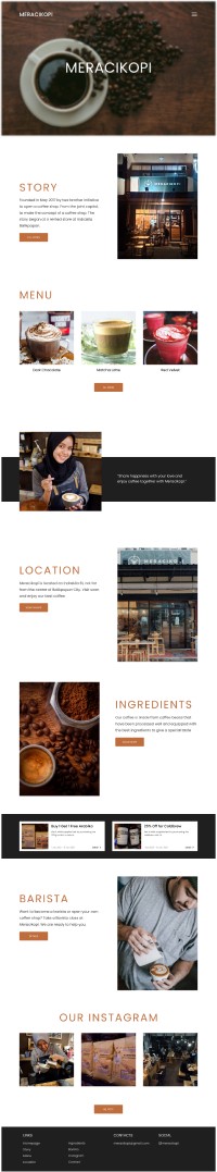
Homepage first iteration
Homepage first iteration
Improving the Design
Improving the Design
Improving the Design
Updating the High Fidelity Design
Updating the High Fidelity Design
Updating the High Fidelity Design
From the first design homepage, I got some revisions. The first revision is changing the CTA button color to ‘dark brown’ to represent the coffee bean's color. Then I also reduced the size of the typography to give a more minimalist and simple look. For the title text, I also changed the color to ‘dark brown’ to give a similar look on each page from the text to the button. The second revision is changing the footer color from black to dark brown, so that the button, text, and footer color, will give the same look and represent Meracikopi’s brand better.
From the first design homepage, I got some revisions. The first revision is changing the CTA button color to ‘dark brown’ to represent the coffee bean's color. Then I also reduced the size of the typography to give a more minimalist and simple look. For the title text, I also changed the color to ‘dark brown’ to give a similar look on each page from the text to the button. The second revision is changing the footer color from black to dark brown, so that the button, text, and footer color, will give the same look and represent Meracikopi’s brand better.
From the first design homepage, I got some revisions. The first revision is changing the CTA button color to ‘dark brown’ to represent the coffee bean's color. Then I also reduced the size of the typography to give a more minimalist and simple look. For the title text, I also changed the color to ‘dark brown’ to give a similar look on each page from the text to the button. The second revision is changing the footer color from black to dark brown, so that the button, text, and footer color, will give the same look and represent Meracikopi’s brand better.
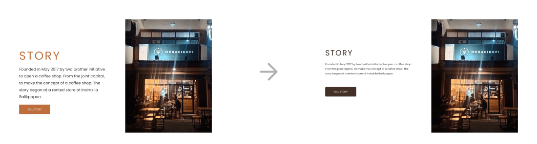

Some changes made
Some changes made
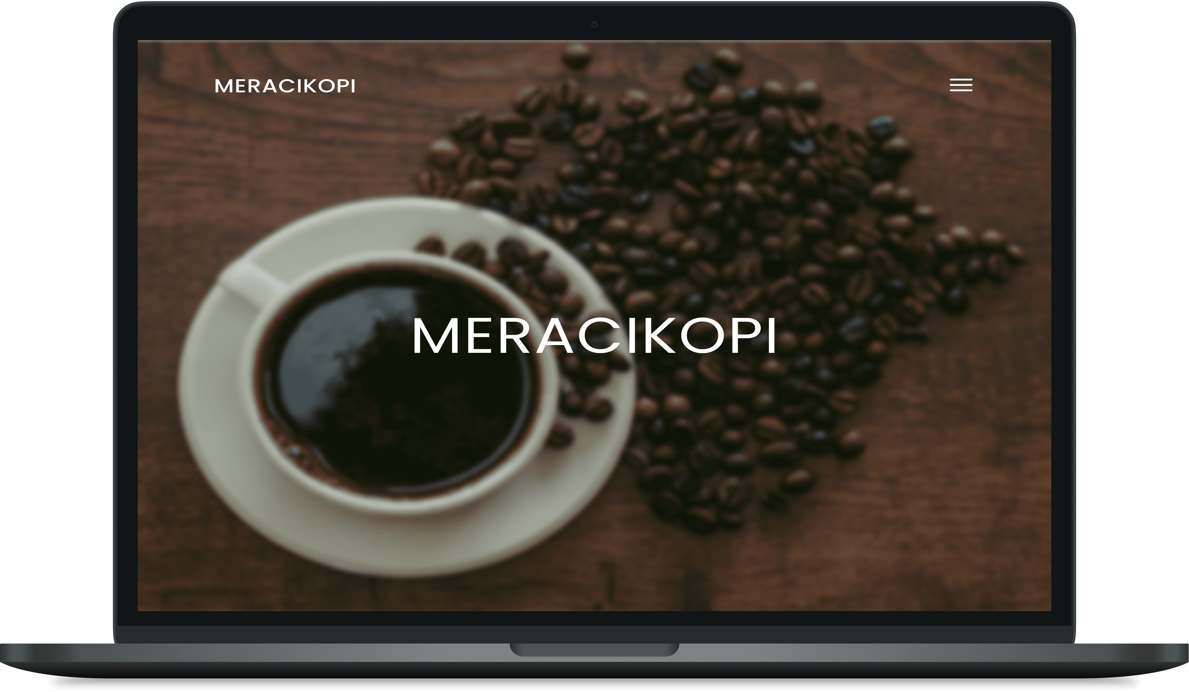
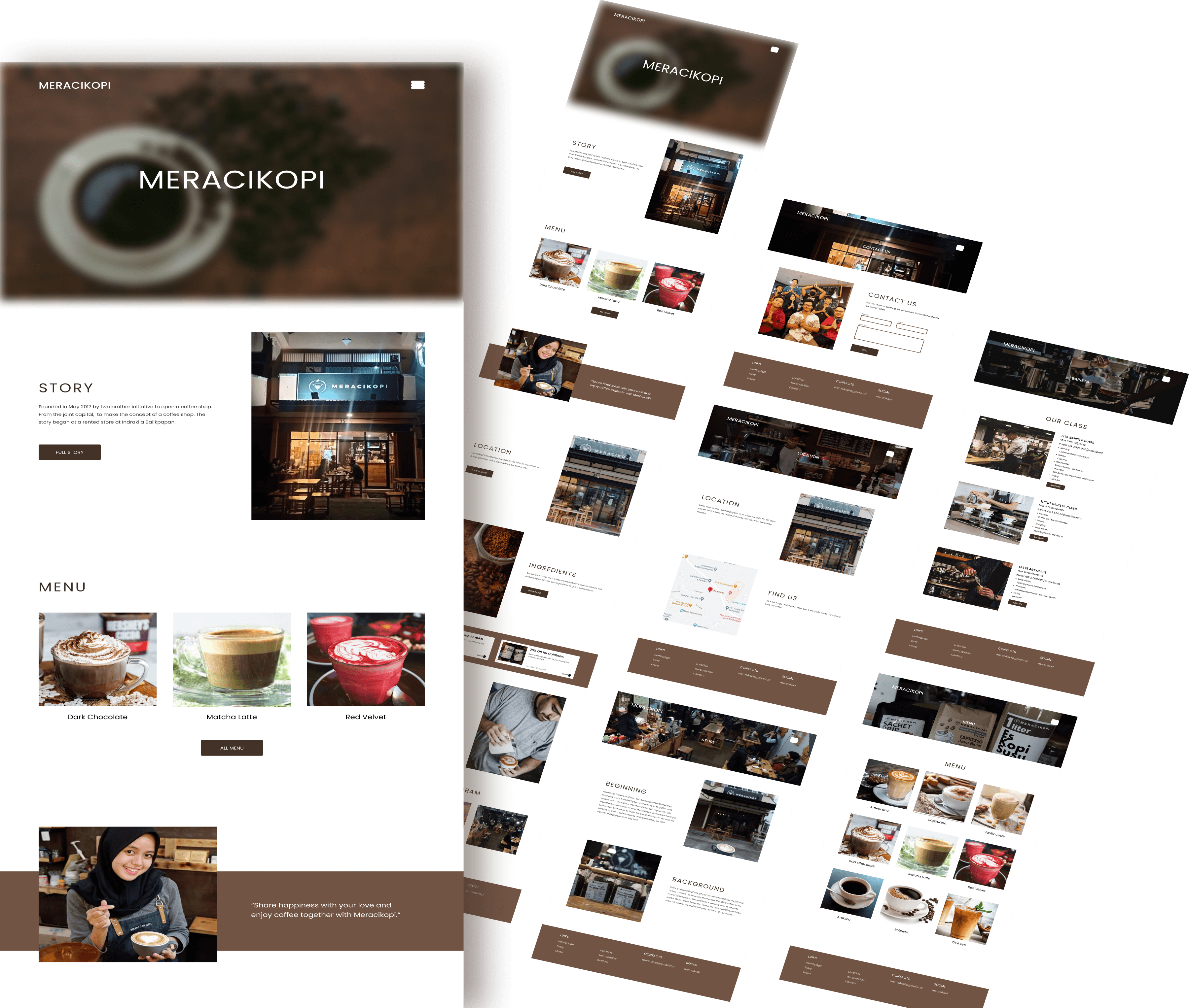
Final Design
Final Design
Final Design
From the first design homepage, I got some revisions. The first revision is changing the CTA button color to ‘dark brown’ to represent the coffee bean's color. Then I also reduced the size of the typography to give a more minimalist and simple look. For the title text, I also changed the color to ‘dark brown’ to give a similar look on each page from the text to the button. The second revision is changing the footer color from black to dark brown, so that the button, text, and footer color, will give the same look and represent Meracikopi’s brand better.
From the first design homepage, I got some revisions. The first revision is changing the CTA button color to ‘dark brown’ to represent the coffee bean's color. Then I also reduced the size of the typography to give a more minimalist and simple look. For the title text, I also changed the color to ‘dark brown’ to give a similar look on each page from the text to the button. The second revision is changing the footer color from black to dark brown, so that the button, text, and footer color, will give the same look and represent Meracikopi’s brand better.
From the first design homepage, I got some revisions. The first revision is changing the CTA button color to ‘dark brown’ to represent the coffee bean's color. Then I also reduced the size of the typography to give a more minimalist and simple look. For the title text, I also changed the color to ‘dark brown’ to give a similar look on each page from the text to the button. The second revision is changing the footer color from black to dark brown, so that the button, text, and footer color, will give the same look and represent Meracikopi’s brand better.
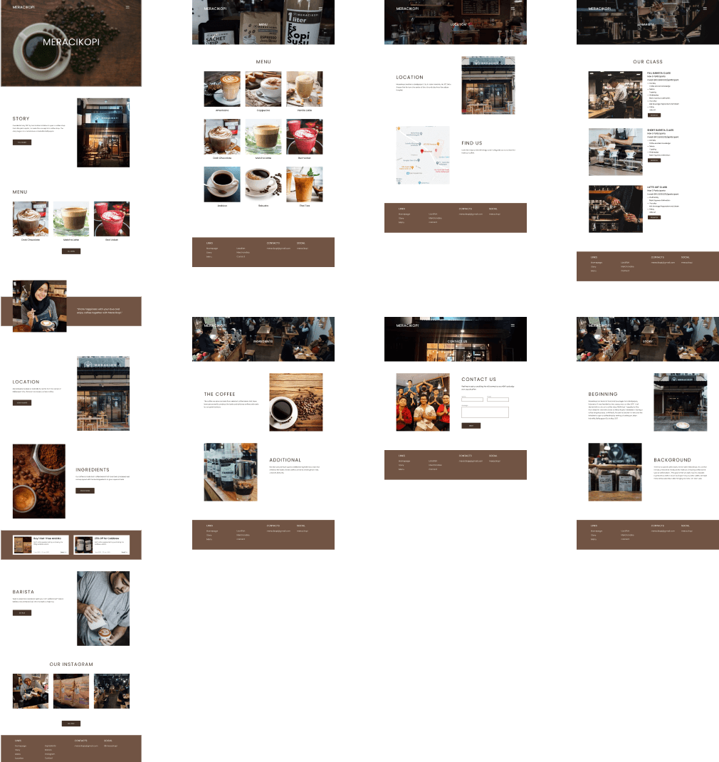
Final Design
Final Design
The Result
The Result
The Result
What We Achieved
What We Achieved
What We Achieved
After some feedback and revisions, the design is finally done. Then the next step is the development process by the developer team. Currently, Meracikopi is looking for a freelance web developer to turn this design into a live website. Although my job for the design phase is done, I’ll be happy to help the developer team in the future until the website is live.
After some feedback and revisions, the design is finally done. Then the next step is the development process by the developer team. Currently, Meracikopi is looking for a freelance web developer to turn this design into a live website. Although my job for the design phase is done, I’ll be happy to help the developer team in the future until the website is live.
After some feedback and revisions, the design is finally done. Then the next step is the development process by the developer team. Currently, Meracikopi is looking for a freelance web developer to turn this design into a live website. Although my job for the design phase is done, I’ll be happy to help the developer team in the future until the website is live.